TRENT ROBERTSON
Experience Designer

Menu
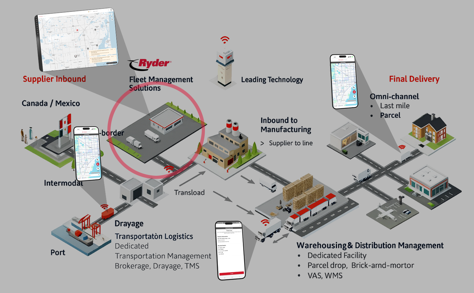
RyderGyde is Ryder Truck’s all-in-one digital platform for managing fleet operations — enabling customers to track vehicles, schedule maintenance, and request roadside assistance. Over time, however, the platform fell behind modern usability and design expectations. Its interface became fragmented, navigation was cumbersome, and the overall experience no longer reflected Ryder’s updated brand or design system standards.
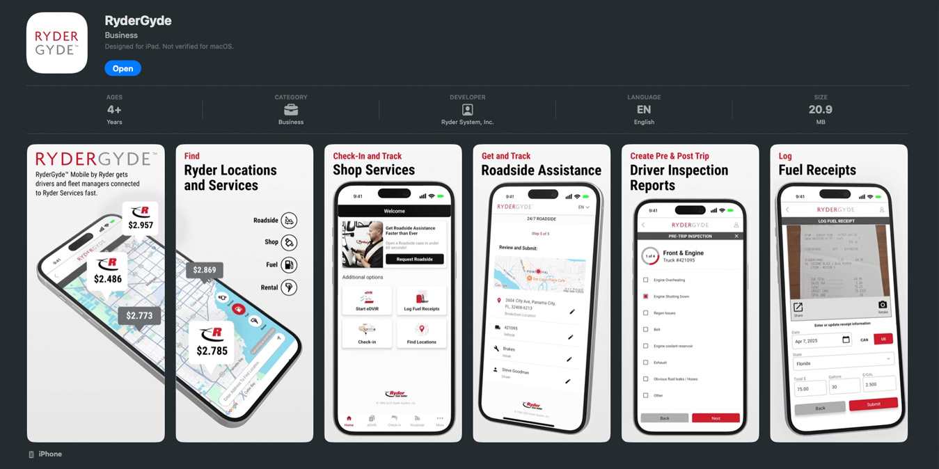
RyderGyde is Ryder Truck’s digital platform for fleet management — a hub where customers monitor vehicles, schedule maintenance, and access roadside assistance. However, as Ryder grew, the app struggled to keep pace with modern usability and design standards. The interface had become visually inconsistent, difficult to navigate, and out of sync with Ryder’s evolving brand and design system.
The goal was to bring RyderGyde into alignment with the new MUI Design System, enhancing usability, accessibility, and visual consistency across web and mobile. This was a 3-month design engagement to modernize the platform and improve the overall user experience for fleet managers and operations teams.
RyderGyde’s existing UI lacked structure and hierarchy, resulting in friction for users who depended on the platform for quick, critical decisions. Navigation patterns were inconsistent, and redundant visual elements made it difficult to find key functions like Roadside Assistance or Vehicle Tracking.
Fleet managers often described the interface as “too dense for something I rely on daily.”Our challenge was to reimagine the experience without disrupting the workflows users already depended on.
RyderGyde’s existing UI lacked structure and hierarchy, resulting in friction for users who depended on the platform for quick, critical decisions. Navigation patterns were inconsistent, and redundant visual elements made it difficult to find key functions like Roadside Assistance or Vehicle Tracking.
To understand where pain originated, I reviewed user analytics, support queries, and NPS feedback, then interviewed fleet managers and service reps.
Common complaints pointed to unclear navigation, visual noise, and redundant steps when accessing vital data.

“It feels like I’m fighting the UI just to find what I need.”
– SW Fleet Manager
This feedback informed key UX hypotheses: simplify hierarchy, standardize typography, and give users a clear mental model for task completion.
During our weekly Zoom calls with users, we spoke with many drivers who helped identify some of the possible reasons this was happening. Volume, time, and pressure really weren't on their side.


During our weekly update calls with users, we spoke with many drivers who helped identify some of the possible reasons this was happening. Volume, time, and pressure really weren't on their side.


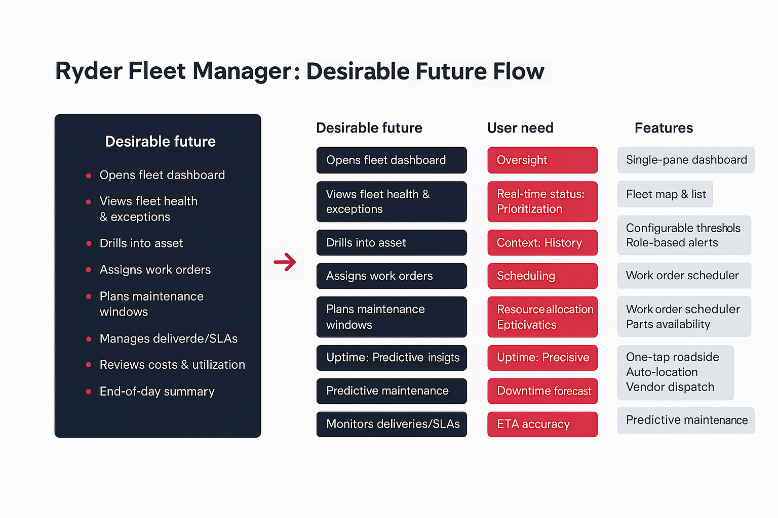
Persona #1: From these findings, I defined one of our primary personas: Alex Martin, a fleet manager overseeing dozens of vehicles. Evan’s goals are speed, reliability, and accuracy — he doesn’t have time to decipher complex layouts.His frustration stemmed from information overload and inconsistent patterns between modules.
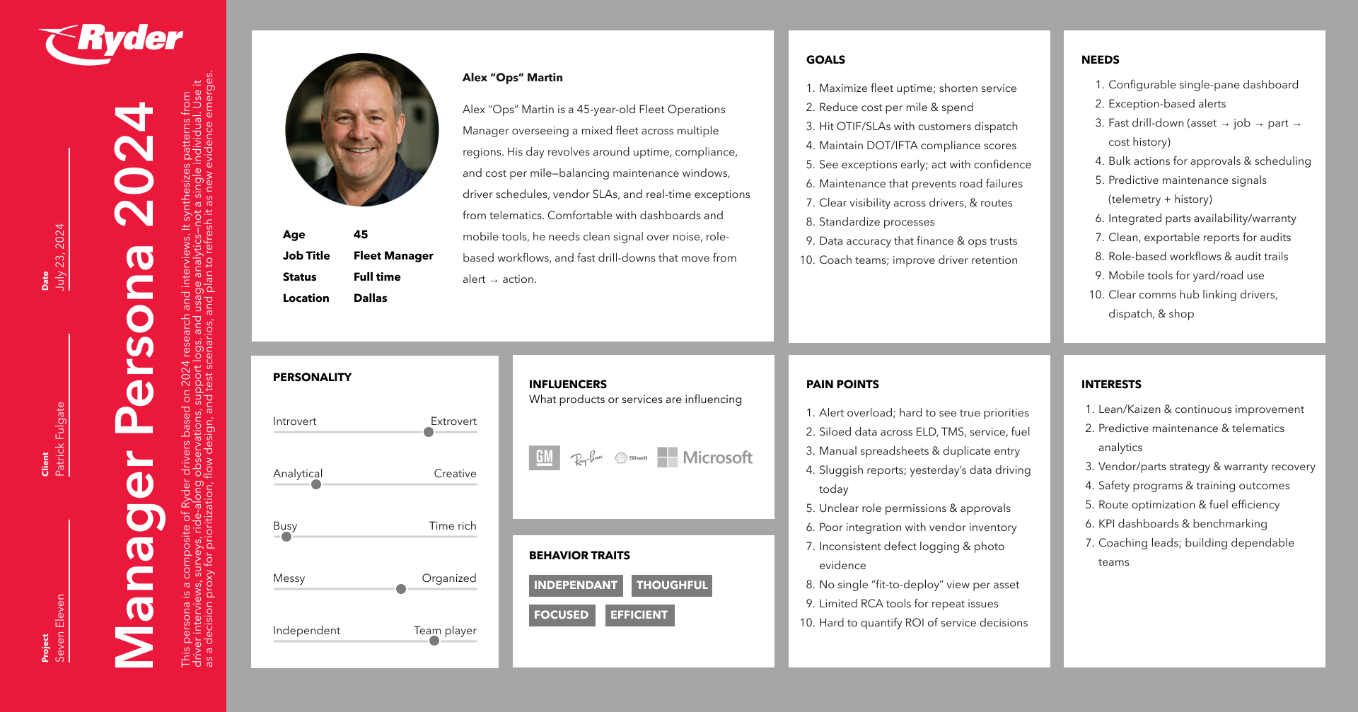
Persona #1: Fleet managers struggled with alert overload, siloed maintenance/parts data, and time-consuming approvals. We introduced a Fit-to-Deploy dashboard that rolls up asset status with shared Status Pills, added deep drill-downs (asset → job → part → warranty/cost), enabled bulk approvals and assignments, and surfaced data freshness with quick export/deep links for action. The result is a priority-first view that speeds return-to-service, improves confidence in decisions, and aligns teams around a single source of truth.
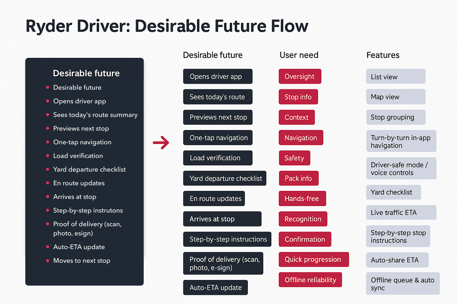
Persona #2: From these findings, I defined one of our primary personas: Mike Santos, a delivery driver responsible for time-critical deliveries. Mike’s goals are safety, speed, and reliability—he needs one-glance clarity for loads, stops, and ETAs and doesn’t have time to decipher complex layouts. His frustrations include cluttered screens, inconsistent patterns between modules, and core actions buried behind too many taps.
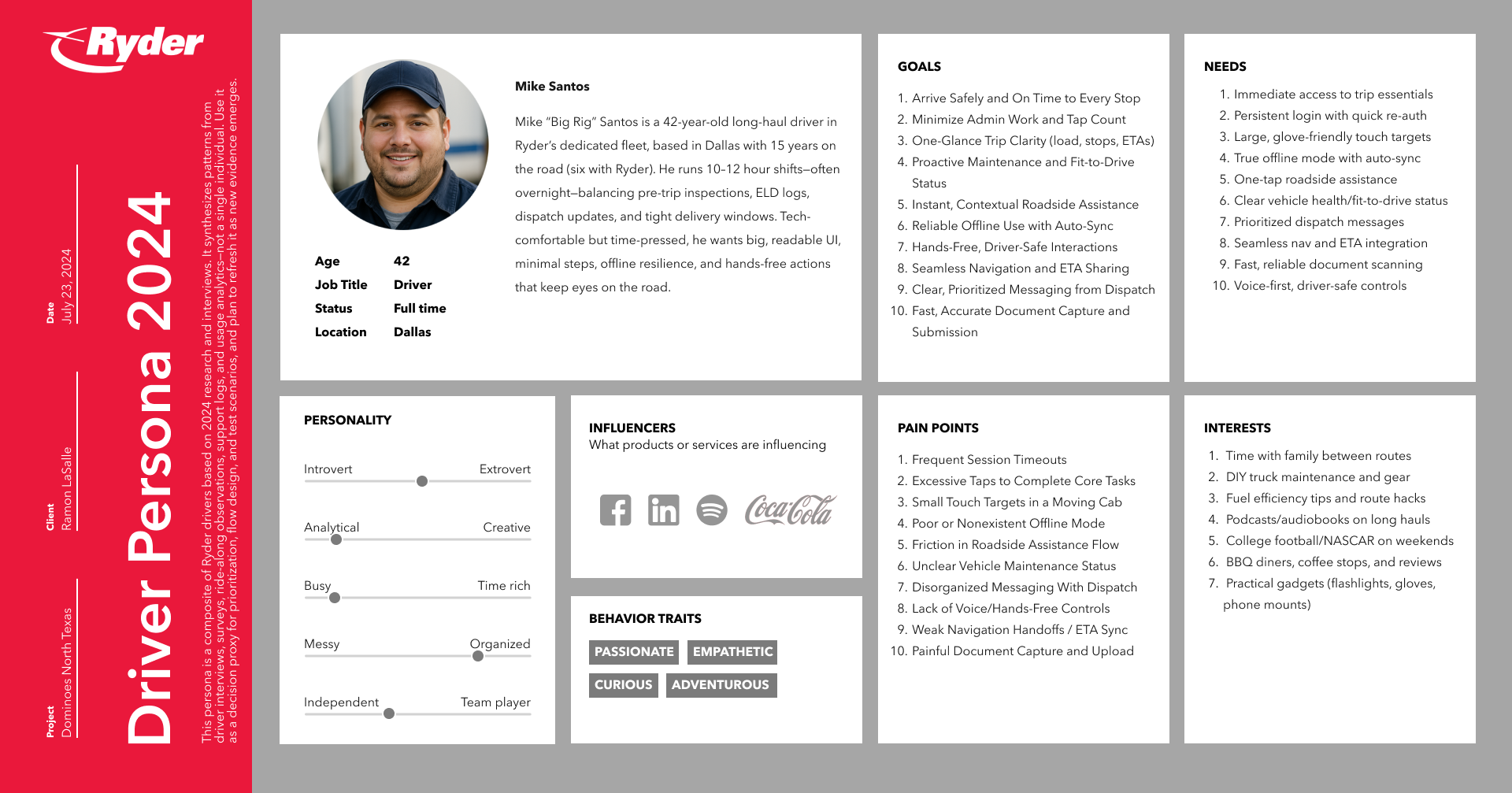
Persona #2: Research showed drivers were slowed by too many taps, small targets in a vibrating cab, and re-entering known info during roadside events. We redesigned the Driver Home into a Trip Card that opens with Next Stop, ETA, Navigation, Roadside, and POD in one place, raised touch targets to 44–48dp, added biometric quick re-auth, and built offline queuing + auto-sync so tasks don’t stall in low signal. Document capture now includes auto-edge detect and glare guidance. Together, these changes make in-cab actions faster, clearer, and safer while reducing avoidable support friction.

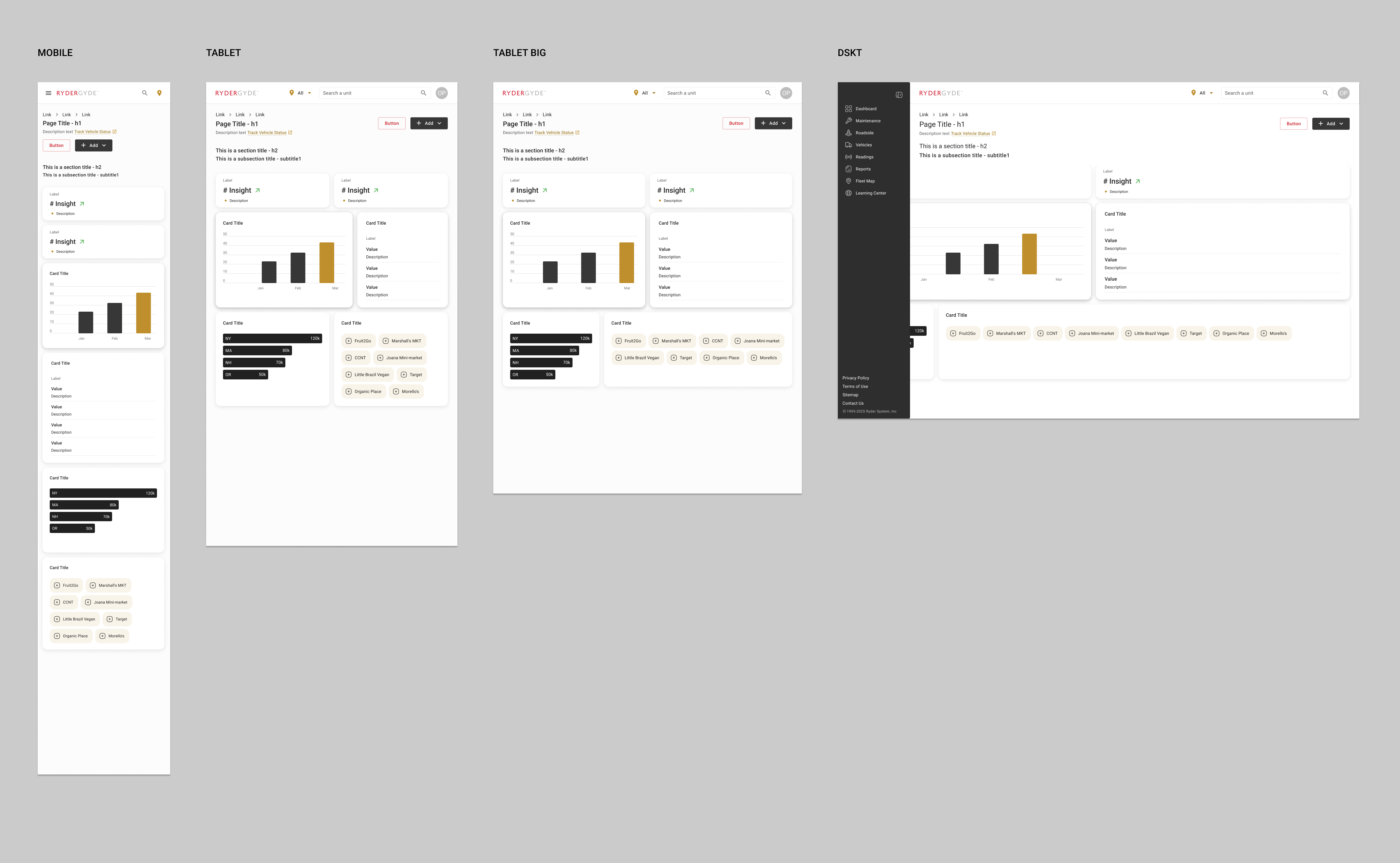
Working within the MUI design framework, I developed a modular system of cards, tables, and navigation components adaptable across Ryder’s digital ecosystem. Here are a few design principles for MUI:
The visual approach emphasized clarity, hierarchy, and brand integrity.
Typography, color, and motion were unified under one system, making each interaction consistent and intuitive.
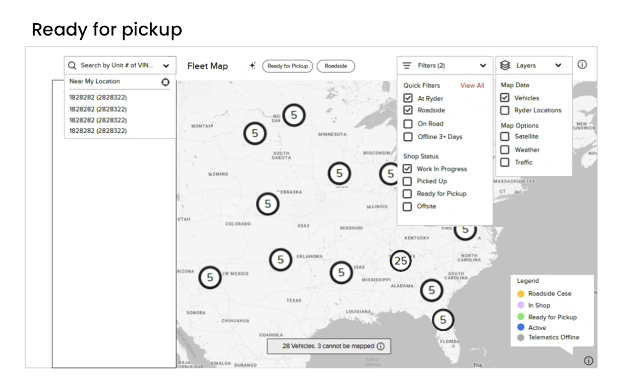
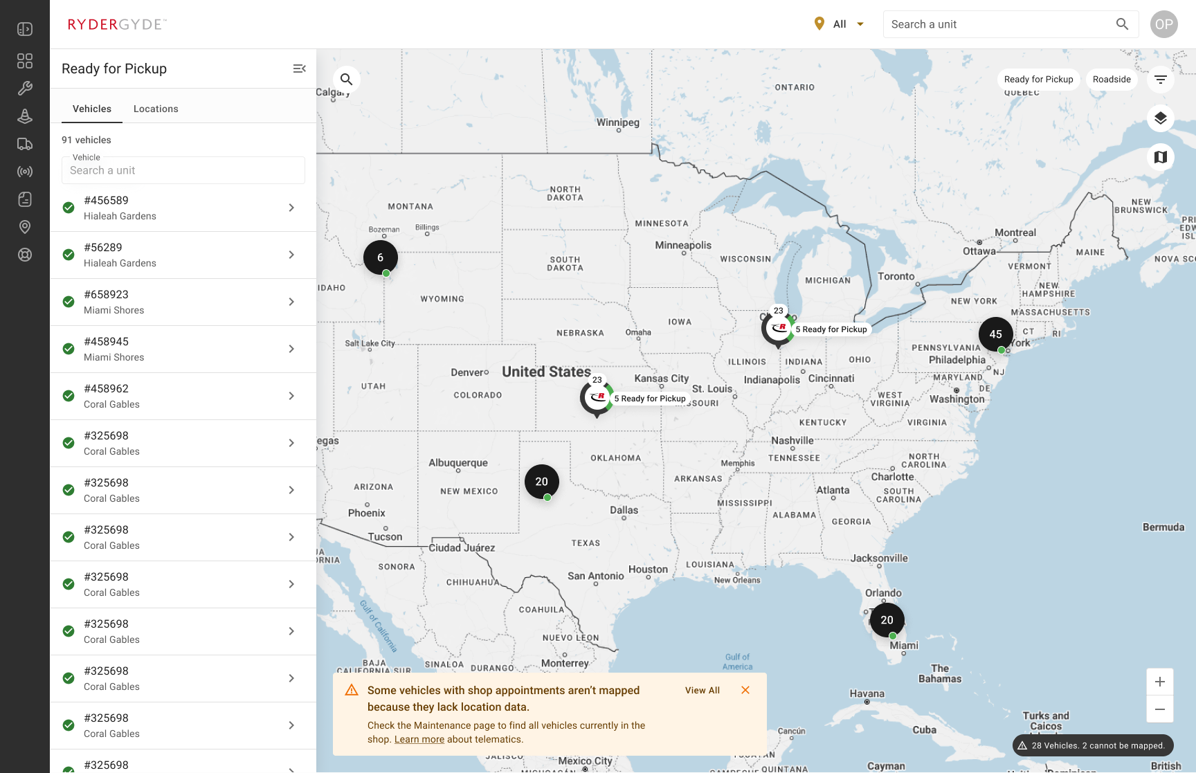
Key MVP map enhancements:
In the RyderGyde map redesign, MUI design principles guided the creation of a cleaner, more consistent and accessible interface. The MUI Grid system ensured responsive layouts that adapted seamlessly between mobile and tablet displays, while elevation and color tokens were used to distinguish route states, vehicle markers, and alert zones without visual clutter. Typography hierarchy made key data — such as ETA, asset ID, and location status — instantly scannable, and accessibility tokens ensured contrast and tap targets met WCAG standards for in-cab use. Overall, MUI’s structured visual language helped simplify complex geospatial data into an intuitive, brand-aligned, and safely operable map experience.

Previous map design

New MUI map design-system iconography with larger touch targets.
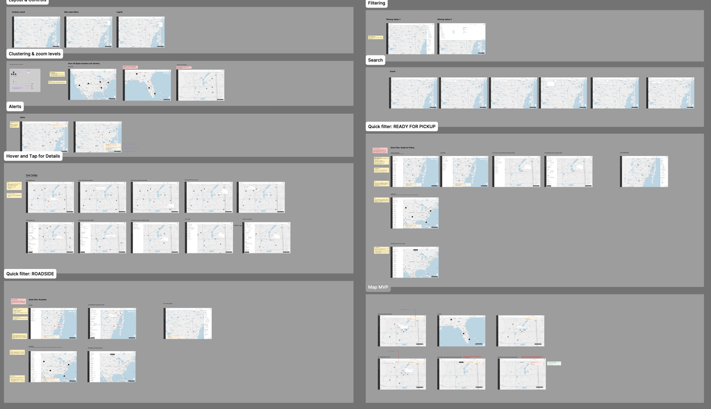
New map designs
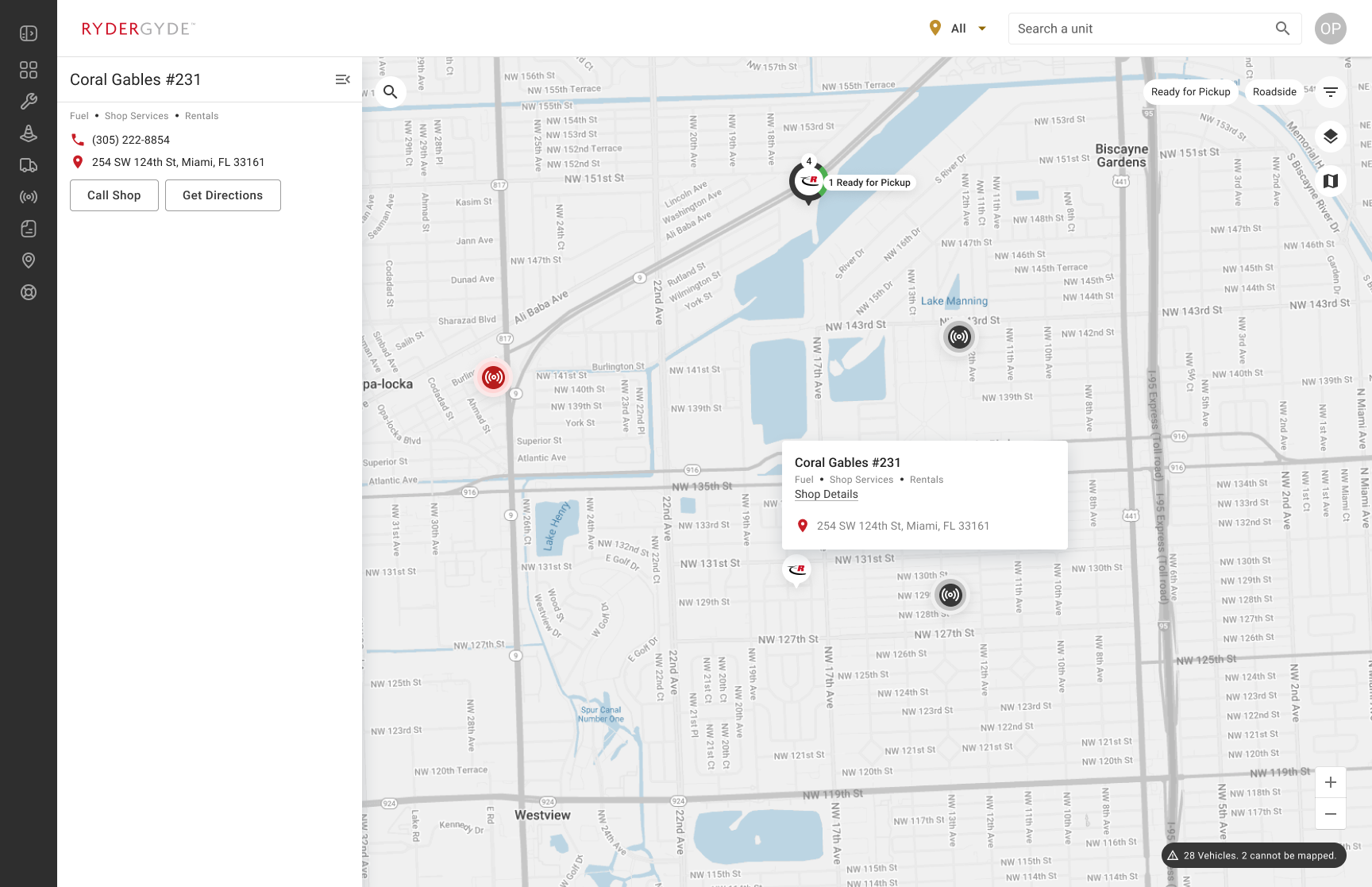
New map design
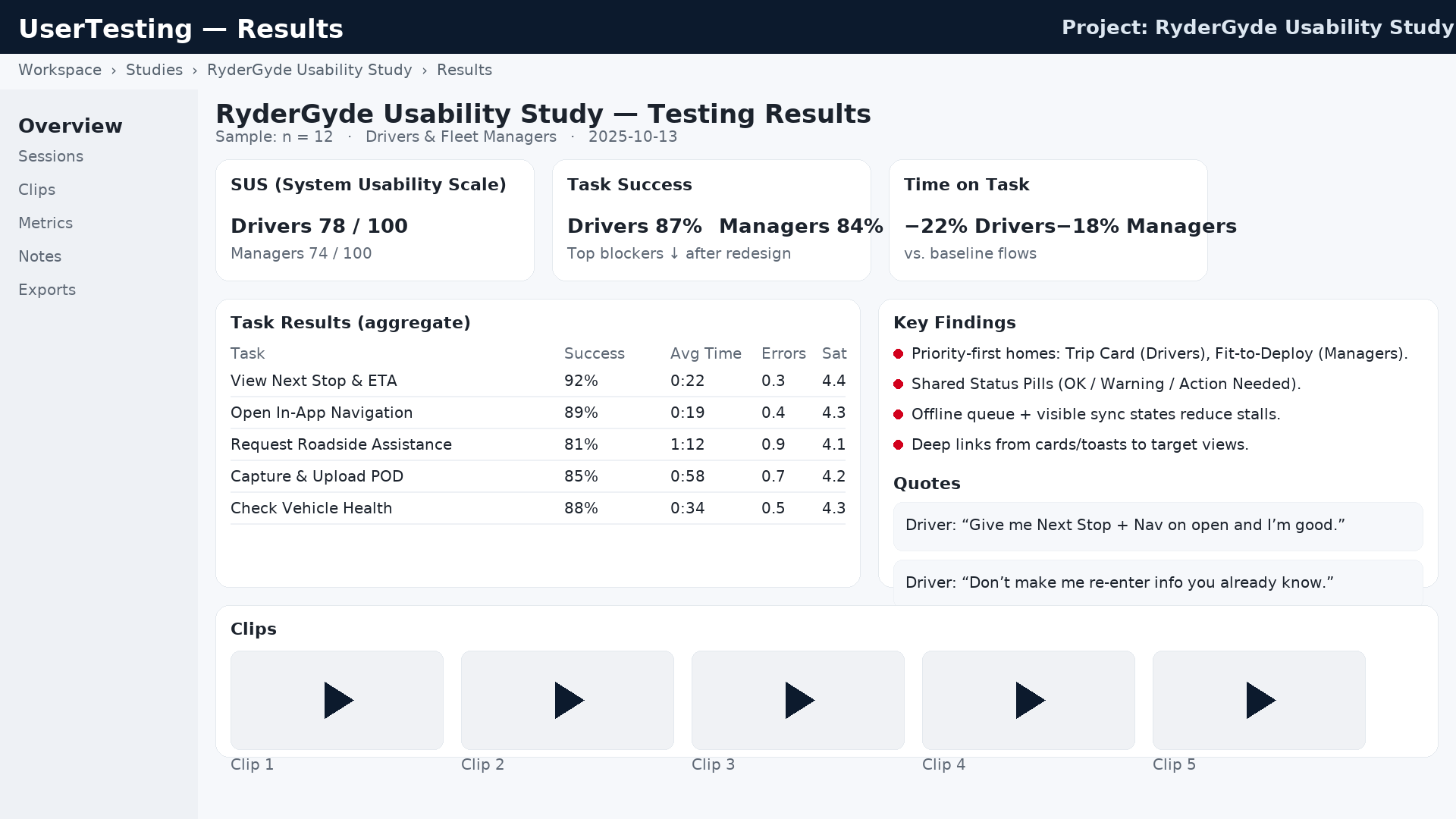
After building interactive prototypes, we conducted remote usability sessions with fleet managers and drivers.
Tasks included locating service information, initiating roadside requests, and tracking vehicle history.
Results:
The new RyderGyde interface reflects a mature, enterprise-grade experience—bold typography, structured layouts, and seamless integration of the MUI component library.
Every element serves a purpose: data tables are readable at a glance, alerts are color-coded for urgency, and the overall tone is calm and industrial, mirroring Ryder’s brand.
Before → After comparison:
Following the redesign, Ryder’s digital team began extending the MUI system across additional tools, including Maintenance Scheduling, Fuel Management, and Driver Insights AI dashboards.
Future enhancements will explore AI-powered anomaly detection and predictive maintenance features to further reduce downtime.
Personally, this project reinforced my belief that system-driven design isn’t about uniformity—it’s about empowering users through predictability.
With the new design system in place, Ryder now has the foundation to scale its digital experience intelligently and cohesively.


